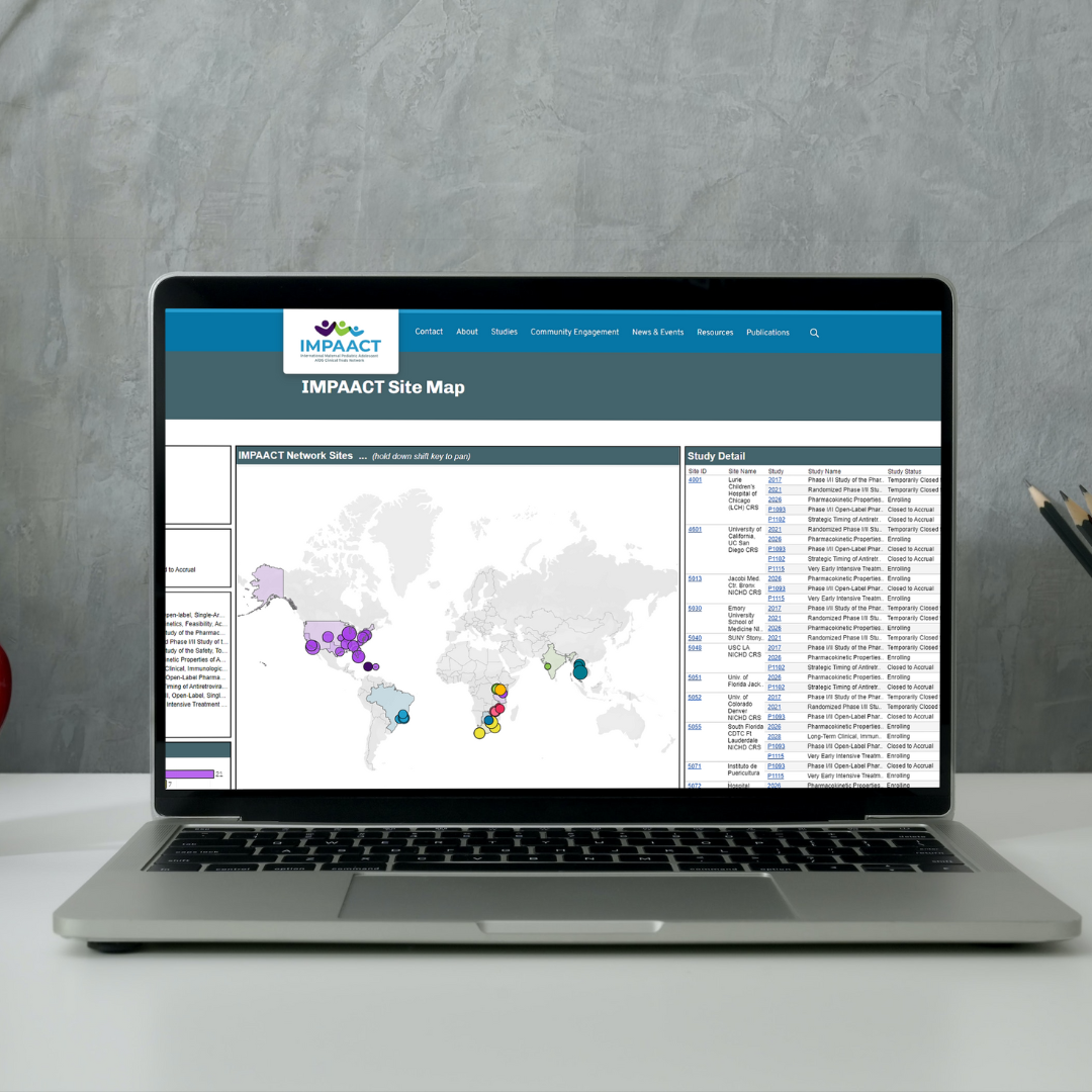
The IMPAACT Data Management Center, in collaboration with the Operations Center, has developed a new data visualization to highlight IMPAACT sites and their work. The visualization includes options to sort and view participating IMPAACT studies by country, study, or research area, with additional details on study status and accrual by site. The visualization is best viewed in Microsoft Edge, but is also compatible with Google Chrome and other internet browsers.